Table of Contents
New look, same WhiteSight A rebrand can mean a lot of different things – a new identity, a fresh start or a restart, or just an upgrade. For WhiteSight, it’s all of them combined. Our original look, which formed our identity from the get-go was simple yet playful. As we grew, our ideas grew, and our vision broadened too. We wanted our new identity to define where we are today and where we’ll be going from here. WS reimagined“Uncover whitespaces, lead change” has been our motto from day one. That, along with our focal points of “whitespace” and “insight” (which blend to form our name), formed the starting point of the rebranding ideation. After a lot of iterations, we settled on the idea of a prism representing the insight into the whitespace. The colours that embody our new identity – purple, dark blue, cyan, and black – weigh towards a cooler palette while still being dynamic. The purple and dark blue come together to form a soothing gradient that you will see a lot across our website and some of the existing content we have created. Shifting away from the condensed Barlow we were using previously, simple and clean Montserrat […]
This post is only available to members.
Already a subscriber? Log in to Access
Unlock this blog
Gain exclusive access to this blog alone.
Radar Subscription
Select a membership plan that resonates with your
goals and aspirations.
Not Ready to Subscribe?
Experience a taste of our expert research with a complimentary guest account.
We publish new research regularly. Subscribe to stay updated.
No spam.
Only the best in class fintech analysis.
Related Posts
- Kshitija Kaur and Sanjeev Kumar
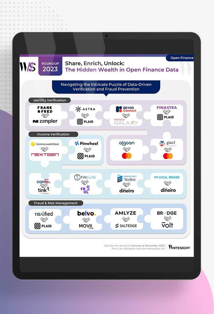
From Data Streams to Enriched Data Fountains Remember the early days of plumbing? Water flowed freely, but its quality was...
- Samridhi Singh and Sanjeev Kumar
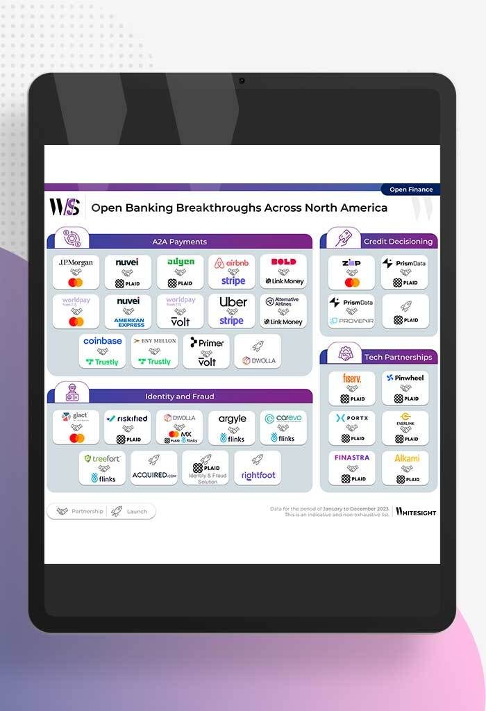
North America’s Open Sesame: Use Cases Bloom Open banking has garnered significant attention in recent years, and at Whitesight, we’ve...
- Samridhi Singh and Sanjeev Kumar
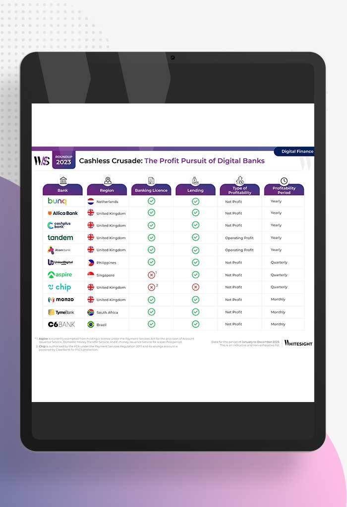
Profitability Unlocked: Licences, Service, and Survival The rise of digital banks has sparked a paradigm shift in how we perceive...
- Sanjeev Kumar and Risav Chakraborty
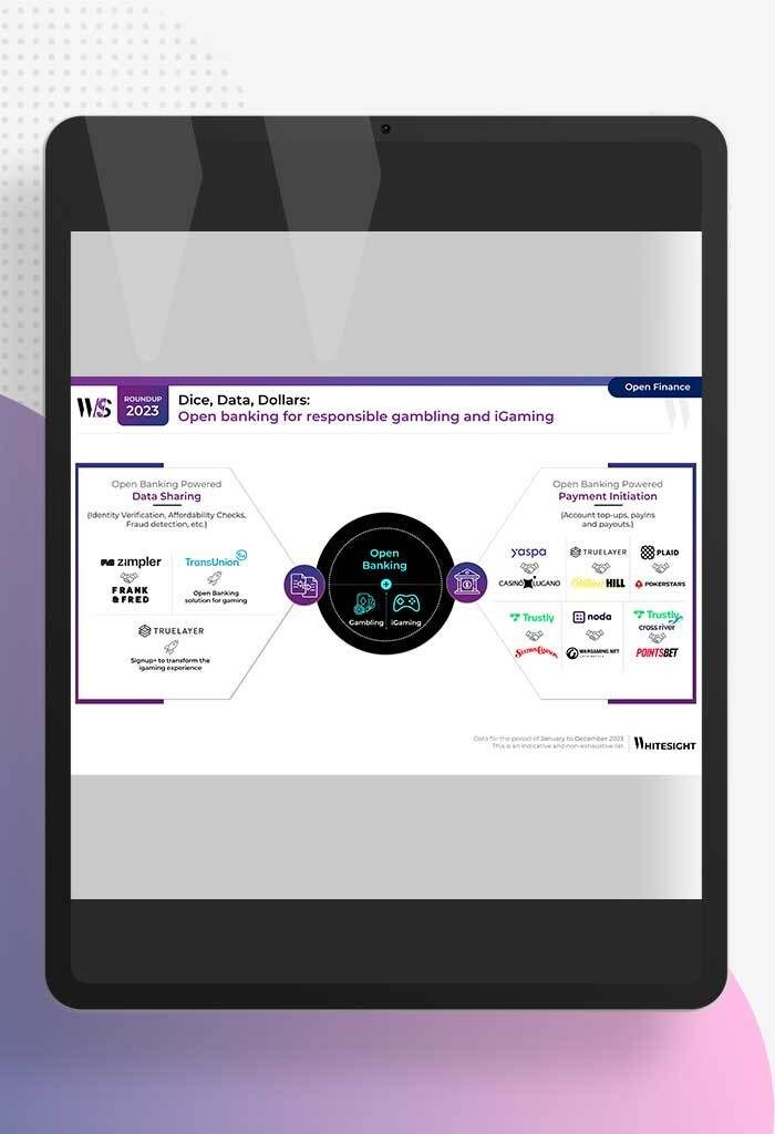
High stakes in the gambling sector The online gambling industry is booming, with a projected market size of $107.3B by...
- Sanjeev Kumar and Risav Chakraborty
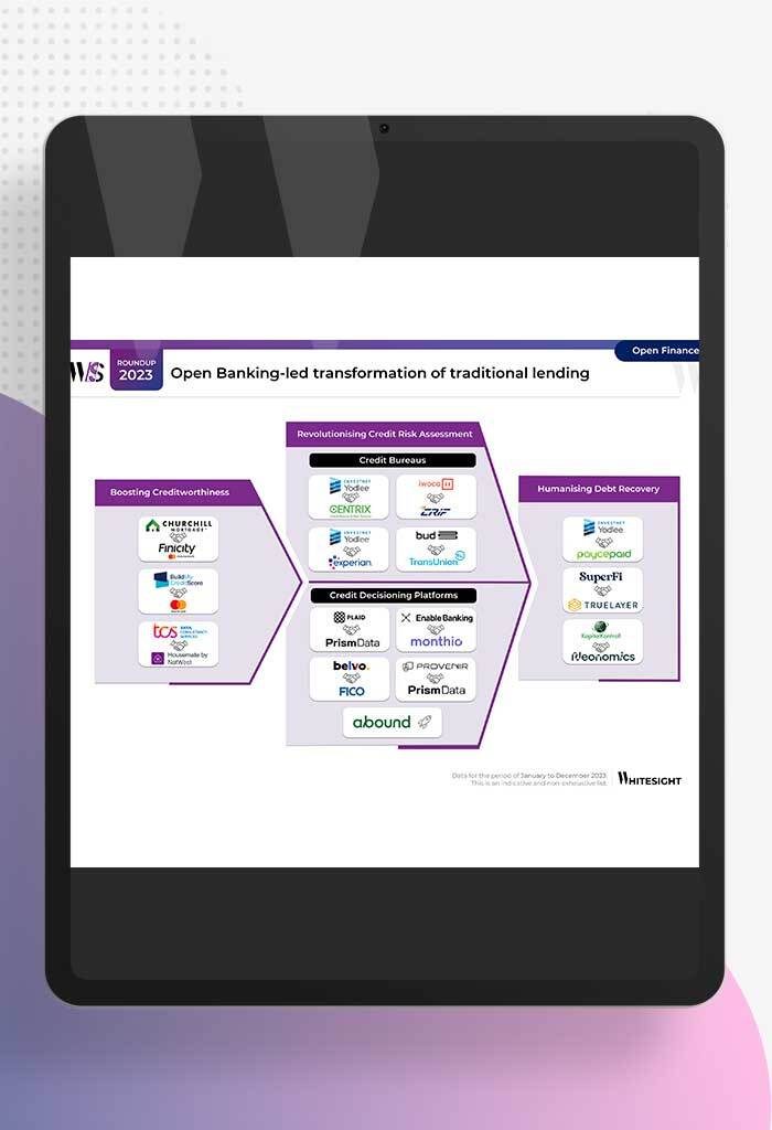
Open Banking-led Transformation of Traditional Lending In 2023, a wave of innovation swept through the lending industry, thanks to several...
- Sanjeev Kumar
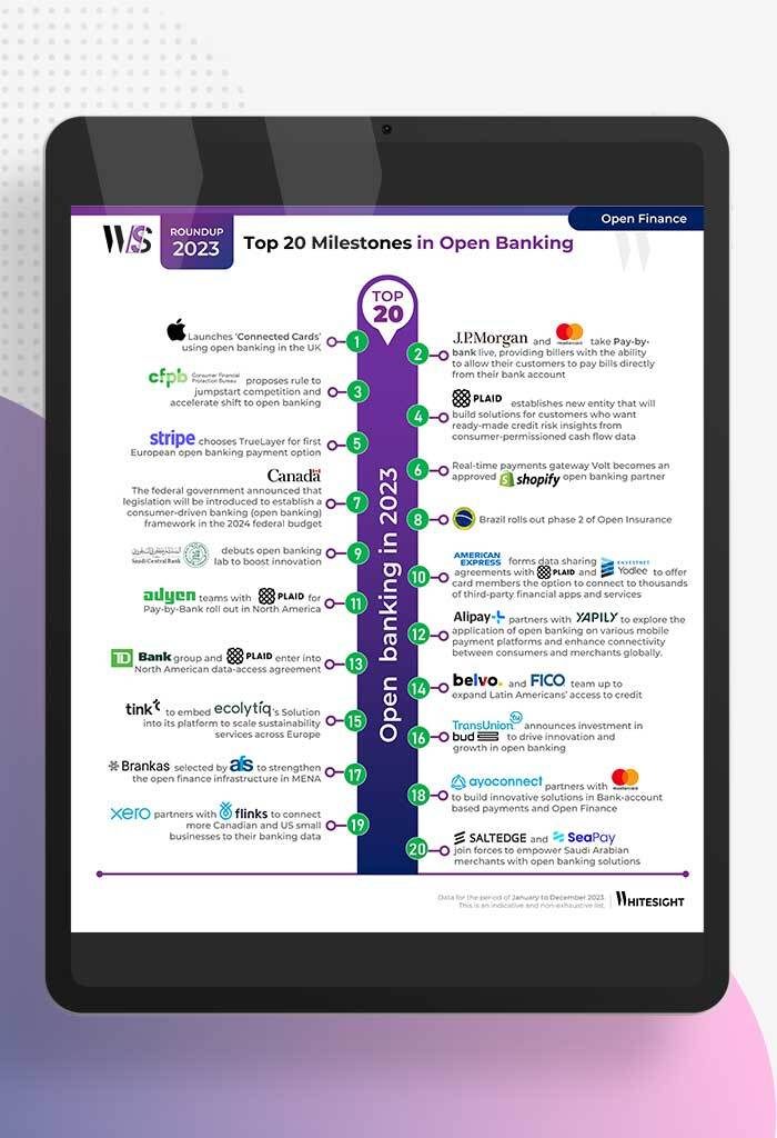
Unmasking Open Banking’s Game Changers in 2023 2023 has been a pivotal year in the world of open banking, marked...
